
 STUART JORDAN looks at the modernisation of the British Rail brand.
Beeching’s famous report in 1963 proposed the closure of more than 4000 stations on the network. This event was a defining point in British Railways’ history, and some saw it as a chance to modernise and redefine the brand after the network itself had received a shake-up.
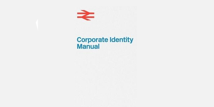
The management at BR wanted to move away from the stuffy and anachronistic heraldic symbols that had previously been used, towards a more modern look in the vein of London Transport. The industrial designer Milner Gray chaired the Design Research Unit, the result of which was the Corporate Identity Manual; a four-volume guide intended to modernise the image of British Rail (as it was now known) and attract new customers.
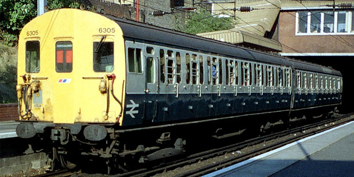
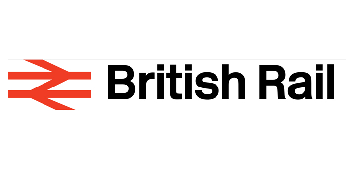
The first volume was published in 1965 and contained details regarding livery design and typefaces. Rail Blue and Pearl Grey were introduced for rolling stock, giving a new unified look to coaches previously painted in regional colours. Also introduced in the first volume was the typeface ‘Rail Alphabet’, designed by Jock Kinneir and Margaret Calvert. Kinneir and Calvert had previously worked with the Department of Transport to redesign British road signs and introduce the ‘Transport’ typeface.
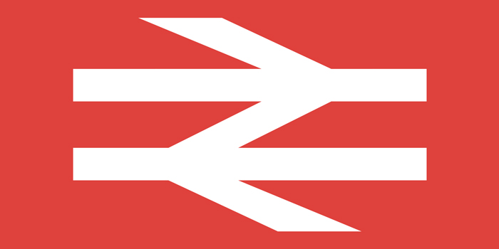
The most notable introduction was the British Rail Double Arrow, designed by Gerald Barney. The design comprises of two interlocking arrows which symbolise a double track. This symbol has become synonymous with the railways even after the British Rail era.
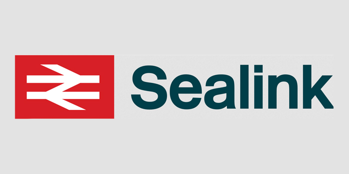
Volume two was published in 1966 and contained information on how to use the new corporate identities on printed posters and leaflets. The third and fourth volumes followed in 1970 and dealt with the non-railway sectors such as architecture and Sealink.
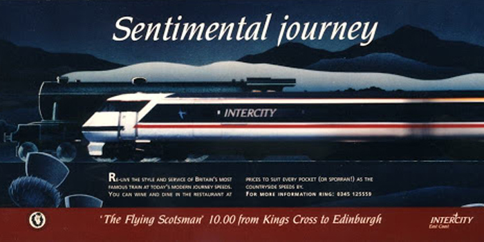
The uniformity of the ‘Rail Blue’ era continued until the 1980s when sectorisation was introduced. Several different parts of British Rail began using their own corporate identities. Intercity, Railfreight, Regional Railways, and Network SouthEast all used liveries and designed derived from, but not identical to, the details laid out in the Corporate Identity Manual. This is seen by many as a prelude to privatisation in the 1990s when only the Double Arrow would live on.