
 STUART JORDAN looks at how early Twentieth Century designers shaped the iconic Underground brand.
The unified brand image of the London Underground came a long time after the first lines opened in the 1860s. The development of the Tube lines mirrored that of the development of railways across the country – single lines run independently eventually being bought out and subsumed into larger and larger companies.
By the early years of the Twentieth Century, the various tube lines were run by the Underground Electric Railways Company of London (UERL) and the Metropolitan Railway, itself owned by the London and South Western Railway. Their subsidiary lines included the Great Northern & City, the East London, and the Waterloo and City railways. The Met already had a house-style for their stations; the distinctive ox-blood tile facades designed by Leslie Green. Some stations, including Farringdon and Paddington on Praed Street, had been rebuilt in a neo-Classical style by Charles Walter Clark, but the Met soon abandoned this style due to changing fashions.

Russell Square Station, with ox-blood tiles.
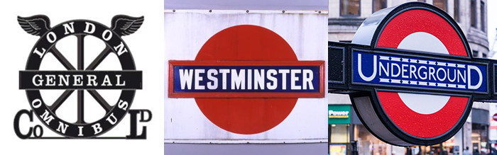
A joint marketing agreement was made between the companies, to unify the various aspects of the image across the network. The distinctive London Underground roundel was first used in 1908, consisting of the station name with a solid red disc behind it. The roundel was first used in a London transport aspect by the London General Omnibus Company, which would come full circle (pun intended) when the London Passenger Transport Board merged public transport in London under one body.
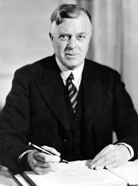
Frank Pick.
Frank Pick, CEO and Vice Chairman of the UERL, was very keen on consolidating the corporate identity of the Tube. He wasn’t keen on the solid red roundel, so he passed it to designer Edward Johnston to develop. Taking inspiration from an earlier poster design, Johnston created the familiar ring design, introduced in 1919, which is still used to this day.
The inspiration, the first attempt, and Johnstons' roundel.
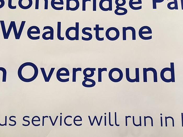
This wasn’t the first work Johnston had produced for the Underground. Known as the ‘father of Modern Calligraphy’, Johnston was incredibly influential amongst designers of lettering and typefaces, including Eric Gill. Frank Pick approached Johnston in 1913 to produce a typeface for the Underground. He produced his eponymous sans-serif typeface to look modern and reflect the 20th Century. When the London Passenger Transport Board was created in 1933, Johnston Sans became the unifying typeface for public transport across London. The typeface has had several redesigns to create different weights, italics etc. and Johnston’s roundel and typeface are now internationally recognised as representing London as a whole, not just the transport network.
A modern version of Johnston's typeface on a poster.
Johnston’s Modernist typeface wasn’t the only way the Underground was embracing the new century and new ideas in design. Pick commissioned architect Charles Holden to design seven new stations for the extension of the City and South London Railway. These stations, such as South Wimbledon, were built in a Modernist style with double-height ticket halls and glazed frontages. Holden also designed the UERL headquarters at 55 Broadway, above St James’s Park station. This large building was steel framed, built in a cruciform shape (to increase natural light into the offices) and faced with Portland stone and Avant Garde sculptures. The building is now luxury apartments.
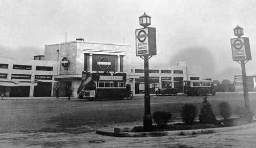
Morden Tube Station, one of the new stations on the Underground reflecting modern styles.
In the 1930s, Holden worked on stations for the extension of the Piccadilly line. These stations were designed in an Art Deco style, influenced by a tour of Europe made by Pick and Holden to investigate modern architectural styles. These stations were built in simple forms such as cylinders and rectangles, with large windows to allow as much natural light as possible into the ticket offices.
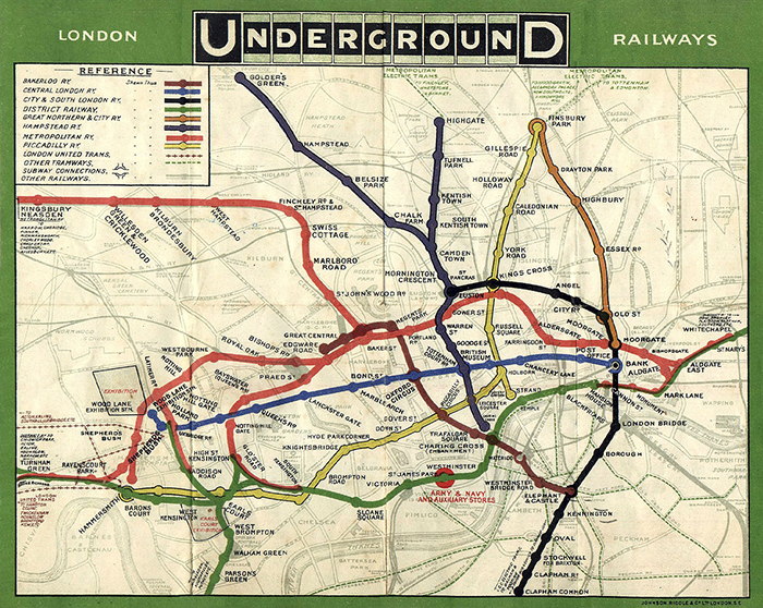
An orignal tube map from 1908.
The 1930s also saw the development another icon of the Underground, the Tube Map. Early tube maps showed the stations in their geographical locations, with the lines drawn to their actual route. Harry Beck was an engineering draftsman who worked in the Signals Office for the Underground. The story goes that he was inspired by an electrical circuit that he was drawing; he realised the geographical location of the stations didn’t matter, customers just wanted to know which line to catch and where to change trains. He submitted his idea to Frank Pick in 1931, but the idea was rejected as it didn’t show relative distances between stations. Beck persisted and the positive reaction to a trial of the map in 1932 led to the map being adopted across the network. The current version of the Tube Map includes other London Transport systems, including the DLR, Overground, and even the Emirates Air Line cable car over the Thames. Beck’s design has been adopted by transport networks across the world.
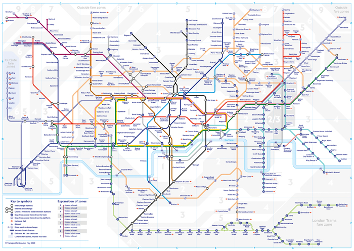
The current tube map crams in as much transport information as possible.
The newer stations, especially those on the Jubilee Line, were built in a high-tech style by architects such as Norman Foster; but they still retain the brand image and iconography developed by Pick, Johnston, and Beck in the first half of the Twentieth Century.